Introduction
This project aims to analyze and visualize the changes in average yearly temperatures across different counties in the US from the year 1960 to 2022. The analysis is performed using R, focusing on spatial data handling, visualization, and data processing.
Libraries Employed
- ncdf4: Aids in handling netCDF data.
- here: Utilized for constructing file paths.
- tidyverse: Essential for data wrangling and visualization.
- terra: Handy for handling raster data.
- sf: Engaged for managing spatial data.
Data Sources
- Temperature Data: Acquired from NOAA Monthly U.S. Climate Gridded Dataset
- Citation: Vose, Russell S., et al. (2014): NOAA Monthly U.S. Climate Gridded Dataset (NClimGrid), Version 1. [1960 and 2022]. NOAA National Centers for Environmental Information. DOI:10.7289/V5SX6B56 [11/4/2023].
- County Centroid Shapefile: Procured from National Weather Service
- Citation Information:
- Originator: National Weather Service
- Publication Date: 1995
- Title: Counties of U.S.
- Geospatial Data Presentation Form: vector digital data
- Publication Place: Silver Spring, MD
- Publisher: National Weather Service
- Online Linkage: National Weather Service Geodata
- Citation Information:
Workflow
Data Collection:
- Procure the average temperature netCDF file from NOAA.
- Download the US county centroid shapefile from the National Weather Service
Data Processing:
- Verify and establish requisite directories for data storage and processing.
- Decompress the downloaded shapefile.
- Load requisite R packages and source custom functions for data processing.
Spatial Data Handling:
- Extract and export specific layers from the netCDF file for the years 1960 and 2022.
- Read in the county centroid shapefile and process it for ensuing use.
Data Analysis:
- Extract temperature values for each county for the years 1960 and 2022.
- Calculate the average temperature for each county for both years.
- Compute the temperature change for each county over the examined time span.
Visualization Preparation:
- Categorize temperature change into assorted ranges for enhanced visualization.
- Prepare a color palette and legend for the visualization.
Plot Assembly:
- Create a plot illustrating the temperature change across US counties.
- Customize the plot with labels, legend, and title.
Saving the Plot:
- Store the final plot to a file named Temperature.png.
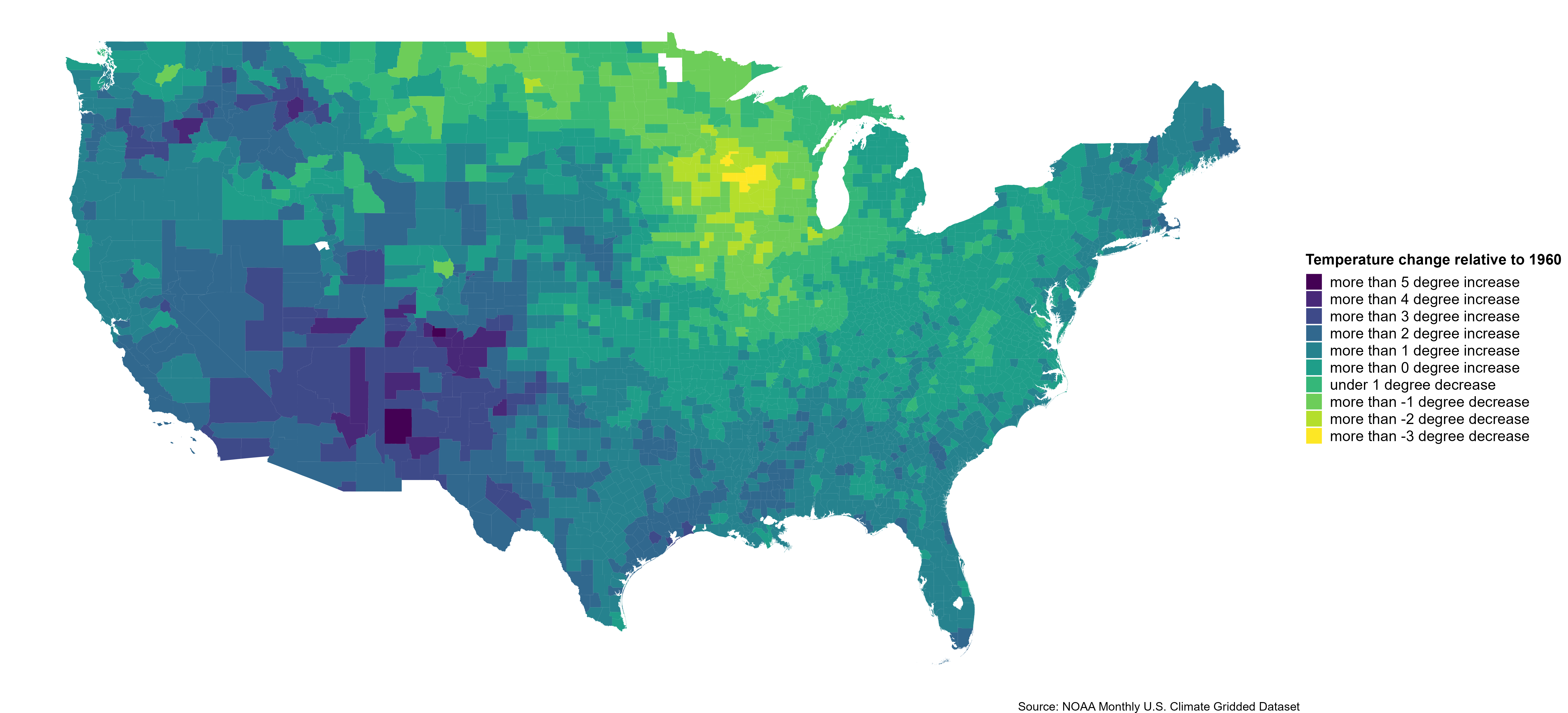
Output
A visualization delineating the change in average temperatures across US counties from 1960 to 2022.
Custom Functions
Custom functions are deployed for particular tasks such as extracting and exporting layers from the netCDF file, extracting values from raster data at specified point locations, and processing the data for visualization.
Code
The code for this analysis can be found in the project GitHub repository